Today we are going to start designing our magazine cover, we are going to base it on Empire magazine. we will have to find a suitable image to put on the front cover, it has to be different than the one we used for our teaser poster.
We are sticking to a black, red and white colour scheme to make it link to our horror theme and also Empire magazine usually have a certain colour scheme for their magazine to relate to what they are advertising on the front.
We have started designing the layout, added title, website tagline and barcode, now we are just inputting other advertisements and we have to find an image that will go.
Monday, 28 March 2011
Final poster
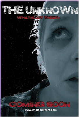
This is our final design for our Trailer poster.
We have added some reviews to make our poster more appealing to an audience, if the audience saw that it had got given four or five stars then they would think it was a good film and more likely want to see it, As the reviews are also by two major entertainment magazines this would make the audience believe it.
We also included our Tagline, 'Whats out there?' to give people a sense of suspense and to wonder what the film would be about. This tagline is really catchy and people will remember it.
Finally the image grabs peoples attention as it is a close up, and you can tell that the girl in the image is scared. The fact that the eye is looking towards of the top of the magazine also draws the reader back to the Film Title.
Monday, 14 March 2011
Feedback Results
Kate has uploaded onto her blog the results from the feedback we got from showing our trailer in our class. she has graphed the data so we can clearly see what the answers are from each question.
Youtube comment
I went back onto our youtube page to see if our trailer has had anymore comments or views.
There was one more comment added which gave positive feedback, although it did lack detail of what they actually thought of the trailer, by saying it was good this makes us happy as we know that our hard work in making the trailer has paid off and is effective.
The video also has had 61 views which is good as the only way we have let people know about our trailer, other than what we have shown to our class is through twitter.
Showing our trailer
last lesson we had our trailer shown on the big screen in front of our class. We produced a feedback sheet for the audience to say what they thought of our trailer. The questions we asked were:
1.From watching this trailer can you see what genre it is?
2.Did you like it?
3.What would you change about it?
4.Would you see it at the cinema?
5.What did you remember from the trailer?What stood out?
6.Did you understand the plot?
By asking these types of questions we get an overall idea of what was good, what was bad and if our trailer would be a success.
Monday, 7 March 2011
Advertising poster
Here we used CBS outdoor website to create a advertisement to advertise our trailer. this is to see how it would look if it was out there on the streets to see if it would be eye capturing and if it will give the effect off that we want, which it to capture the audience and make them want to see this trailer.
Trailer poster
This is our first draft for our poster. It contains the title of our film, The Unknown. The main tagline, Whats out there, And at the bottom of the poster it states that its coming soon, this is to grab peoples attention as they would now keep looking out for more posters which have a release date. the main image is really eye capturing and clearly states that the film is a horror. we still have to make small changes to our poster, such as we have to neaten up the image, add credits, put the release date and we could add some reviews or ratings.
Subscribe to:
Comments (Atom)


